Say Goodbye to Red-Green Color Scales
I used to love them, but it’s over now: diverging red-green color scales.
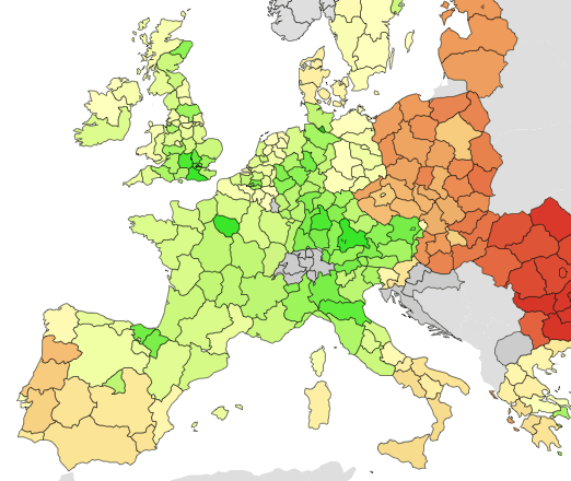
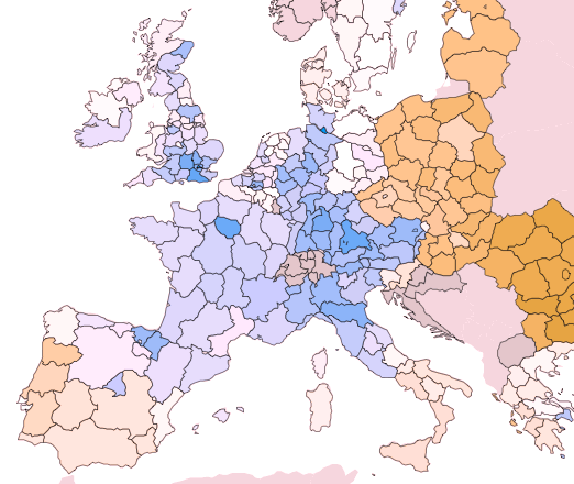
I bet the reason for the popularity of red-green color scales is that they are so easy to interpret (at least in my culture). Green means good, red means bad. For instance, the above map shows the income of private households for European regions. I used a diverging color scale to show the difference from the average income (bright yellow) with higher incomes in green and lower incomes in red. In fact, I picked the exact colors from good old flare visualization toolkit.
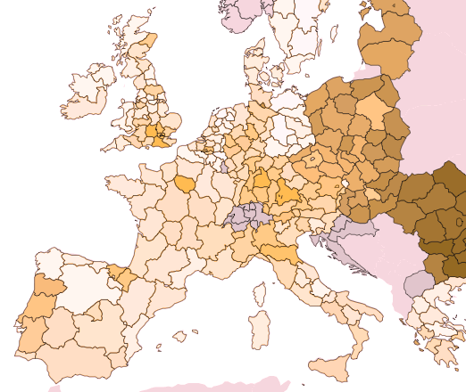
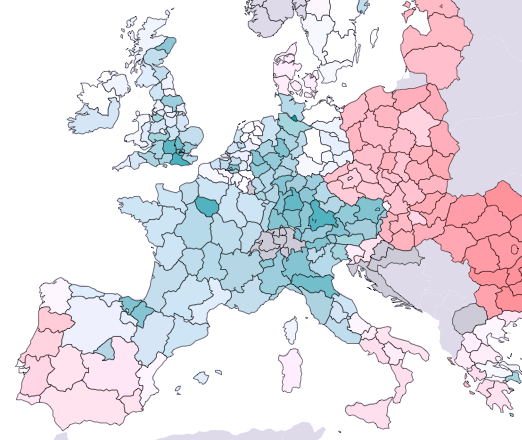
But there’s some trouble with this scale. Firstly, as alluded to above, the meaning of red and green vary a lot in different cultures. According to this helpful collection of Color Meanings By Culture, green is negatively associated in some Eastern cultures like China or Indonesia while red is associated to love, happiness and a long life. The second source of trouble comes in if you want to include dichromats aka color blind people in your audience. Here’s a simulation of how someone with Deuteranope color blindness (aka green blindness) would see the red-green scale:
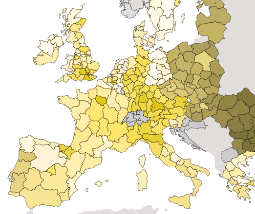
Almost the same problem for people with Protanope color blindness (aka red blindness):
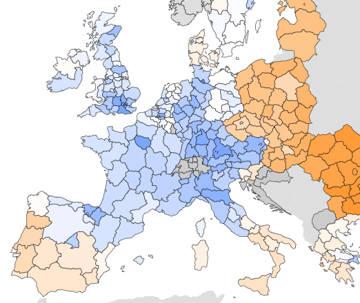
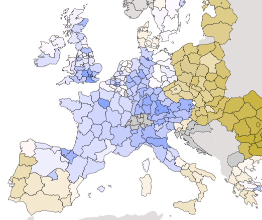
For me, this is enough reason to simply forget about red-green color scales. Forever. Instead, I’ll switch to blue-orange scales. After experimenting around a few minutes, I found that hue values of 220° (blue) and 30° (orange) work out fine:
To make a long story short, here are the Deuteranope and Protanope simulations:
Also everything fine with the third kind of Dichromacy called Tritanope or blue blindness.
At the end I want to recommend a perfect tool for on-the-fly simulation of color blindess which is called Sim Daltonism. Many thanks to Michel Fortin for this. If you’ve heard of a similar tool for Windows and Linux, please let me know. Update: Color Oracle is another great tool for turning the whole screen into a color blindness simulation. Also, there’s an some research work coming with that tool, namely Color Design for the Color Vision Impaired by Jenny & Kelso, 2007. In short, they’re going for purple-green instead of red-green:

Comments
Rahul Gonsalves (Nov 25, 2011)
Check out ColourBrewer 2.0 from Axis Maps: http://colorbrewer2.org/
Helps you choose diverging/converging colour schemes and includes an option to build out colour-blind friendly schemes.
Naomi B. Robbins (Nov 24, 2011)
I use www.vischeck.com to simulate how those with color vision deficiencies see colors.
Gregor Aisch (Nov 24, 2011)
Thanks Mike. Color Oracle and the accompanying research are great resources as well. I’ll update the post on them.
matt (Nov 24, 2011)
In the 150k+ piwik users, there will definitely be all kinds of color blindness, so it is great to see you are thinking about this.
blue/orange color scheme is nice, I can see how it will be useful when plotting percentages or things that can be good/bad? (bounce rates, revenue per visit, pages per visit..)
Or would you also use these 2 colors even to plot the number of visits? One color might be easier to read though in this case?
Nice post!!
MikeT (Nov 24, 2011)
Great resources linked above! I’ve been using a nifty utility http://colororacle.cartography.ch/ (for Mac/Win/Linux) to turn my whole monitor to colour blind momentarily. It has influenced my colour schemes.
Dave Gööck (Nov 24, 2011)
Just one word: awesome!!!
Steve Rogers (Nov 24, 2011)
Culturally defined principles of association! - Psychophysical variance in colour vision! Thankfully, there’s a few decades of colourimetry reserch out there that can yeild good base-line principles for palette design, even if we have to tweak them to account for context dependency. The end of Red(Amber)Green scaling? What will we do without RAG status? BlueOrangeGrey? Nice colours - shame about the accronym.
Gregor Aisch (Nov 25, 2011)
Hi Rahul, I know about ColorBrewer and I really like this resource. However, I don’t like their terms of use that much. Don’t want to put a link to their website below every map, so I rather study color scales myself.
štefan (Dec 07, 2011)
one additional remak on using 2-color graphs:
they can be tricky to print in black & white (still the majority of prints!!)!
i found it usefull to test a B/W-view of the used colors, hue & saturation ;)