When It's Ok to Use Word Clouds
tl;dr It’s ok to use word clouds if your goal is to encourage reading of a large set of otherwise unrelated words that are connected to one or two interesting values (and word count in a text doesn’t qualify as interesting).
@driven_by_data: In #datavis, no rule’s without exception. On rare occasions you can even use word clouds :)
This I tweeted yesterday and now I feel that if I encourage the (dangerous) use of word clouds, I have to explain this exception in a little more detail. Why is it sometimes ok to use a widely rejected visualization method, and most times not?
A lot had been written about why not to use word clouds. It is super hard to decode or compare the values encoded in the font size or text color (if the latter isn’t random at all). Position, perhaps the most effective visual encoding, is essentially ‘wasted’ for the sake of a space filling algorithm (well, due to the spiraling nature of the layout algorithm, positions aren’t entirely random, but still, they don’t “mean” anything in a word cloud).
Plus, thanks to wordle.net, a free-to-use online tool for creating word clouds, we probably all saw enough (bad) word clouds for a lifetime.
So why did I use a word cloud?
The short answer is: because it was a good fit for the dataset. The data we got was pretty interesting. For each combination of street name and street suffix, Zillow gave us the median home value according to their real estate database. Recently they used this data to write a story on what a street name reveals about the home value. If you live on a Main Street, your home is most likely less valuable than homes on Main Roads. Let’s put aside the problem of comparing individual homes with median homes across all streets with the same name (indeed, some readers complained that the data must be wrong, because in their city, Main St. clearly is the better place to live on etc.). It’s still an interesting dataset that you don’t see every day. So we wanted to do something more with it.
One of the first ideas that popped into my mind was Monopoly. Since we also got a per state and city breakdown of street name values, we could have made a ‘create your own Monopoly’ tool easily. Of course, plenty of localized Monopoly boards have been made already, but how many of them select streets based on actual home price value instead of some editorial judgement?
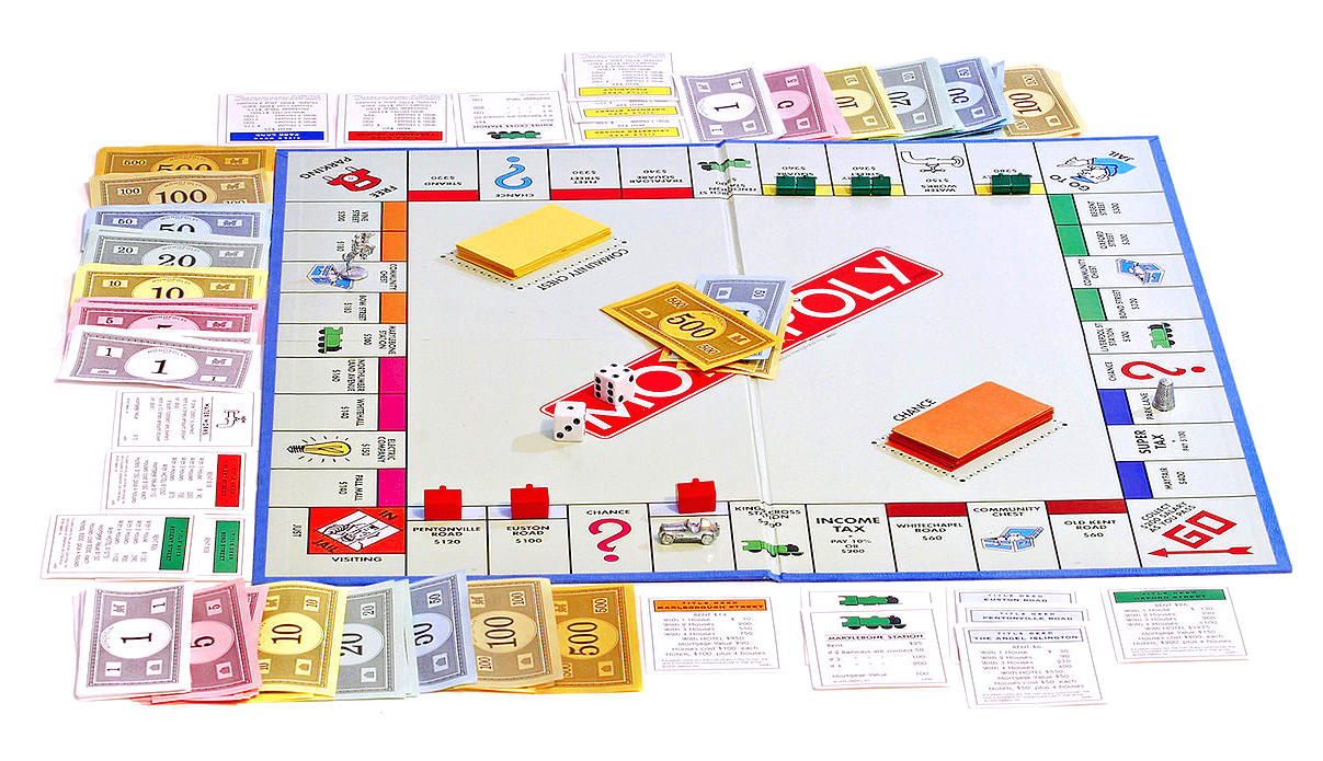
However, after checking back with our legal team at The Times, we had to dismiss this idea, which probably would not have been covered by the fair-use exception for use of copyrighted material.
So I was looking for something else to do with that data. I ran into some problems with simply showing a top x list of streets. Showing the most common streets was easy — I forgot to mention that we also got the total number of homes per street name — but showing the most valuable street names wasn’t. Unsurprisingly, the most valuable street names are in fact just some single streets on places like Miami Beach golf course islands. So that’s not really representative. Of course you can just filter out street names with less than X homes, or that appear in at fewer than Y states. But these cuts are arbitrary. The values I “pick” for X and Y will directly change the make-up of the list of most valuable street names (because the top of the list will always include street names that barely make my filter criteria).
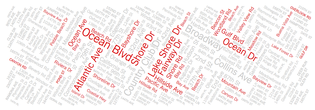
This kind of brought me to the idea of showing as many street names as possible. If top 20 list of most common street names is boring, maybe the top 1000 list isn’t. That’s where word clouds came into the game first. So mainly for looking at the most common streets I created this word cloud, in which street names are sized by the number of homes, and colored by the median home value (from the least valuable streets in gray to the most valuable — among those 1000 streets — in dark red):
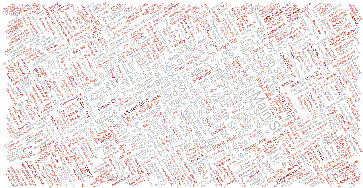
And I immediately liked it. Limiting to two angles made it easier to read, and by shifting both angles a bit I reduced the readability disadvantage that the vertical text would have had otherwise. I felt that this form actually encourages to read through hundreds of street names, something that’s hard to achieve in any other form. Like, reading a thousand street names in an alphabetically ordered list is boring, ordering them by number of homes puts the more valuable streets at the bottom, making the list sortable makes it harder to visually memorize the location of streets, etc. The word cloud solves all these problems. But we weren’t quite there yet.
After all, by increasing the number of streets shown to a thousand I didn’t really solve my arbitrary filter problem. And by focussing on the most common streets I lose the interesting pattern of ‘rich’ street names.
That’s when I got back to Monopoly.
If we can’t use the Monopoly idea, perhaps I can find out what exactly I liked of it. Of course, the idea is without doubt the most fun view on street names, and with the game being around for more than a century, the view is also immediately familiar to a wide audience.
But what’s really great about Monopoly is the diversity of street names. The Monopoly board doesn’t just show the richest streets. It shows the most common (or at least recognizable) street names in eight different groups of street value (each with its own color). As if it wanted to include people from all levels of society, lower incomes, the middle class and the richest one percent.
At this point I had enough to make the word clouds work. By splitting the data up into sub-groups I was able to see the most common street names for different home values. Just like a Monopoly board, but with hundreds of streets in each cluster. The initially break-down into five equally sized groups (by of number of homes) was later I changed to a three group split, mainly because I felt the differences between the ‘middle groups’ wasn’t interesting enough to justify the extra panels. Then I wrote a few sentences to guide our readers through the graphic, and added the filters to help identifying interesting groups of street names in the mess of the cloud. And I also had some fun making the little icons :-).
Click here to see the full graphic.
Summing it up, I think that word clouds can work. But please don’t use them to make randomly colored word frequency charts. Just use word bubbles instead (circle sizes are easier to compare, and you can use position to encode another value). Jim Vallandingham wrote a nice tutorial that helps you getting started.
Do you think I made a huge mistake by using word clouds? Have a different idea for this dataset that might have worked? Let me know!
Cheers!