Why we didn't use a cartogram in the Brexit referrendum map
Great Britain has voted to leave the E.U., and election result cartograms are all over the internet. However, for our map we decided to stick with a simple map instead.
](/blog/images/old/brexit-map-1-1371x1200.png)
Here are a couple of the cartograms I saw:
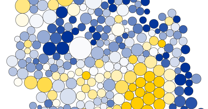
](/blog/images/old/28669015bc0bcb5f80ce982bc295c720.png)
](/blog/images/old/cd143fbd8c796f024536aa8dd8df25e5.png)
While these cartogram are undeniably pieces of beauty, there are still some significant problems.
Cartograms are too confusing for readers unfamiliar with the geography
Distorted geography works for people who know the undistorted geography in and out. But it is very hard to make sense of cartograms of countries you are not familiar with. First of all, we might not recognize the country’s outer shape, which might make some wonder what that thing is that we’re looking at. The same is true with regions within the country. It’s hard to point at Wales in both of the cartograms.
Reading and comparing areas is hard
Interpreting circles sizes is hard enough, but for irregular shapes like in the Guardian’s hexgrid cartogram this becomes even harder. I just doubt that by looking at the cartogram, anyone would correctly “guess” that the total vote was 52% for leave. That’s why, every map was accompanied by at least one bar chart showing the result.
Geographical area isn’t just “noise”
Geographical area is not just noise in a map. Especially with election maps, where regions are often roughly designed to contain similar population, the area tells us something important about the regions: population density. Which is an indicator whether some shape you’re looking at might be a city or a rural area. In cartograms, this information gets lost. 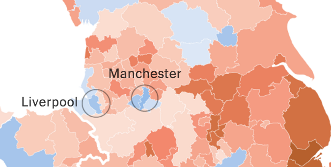
Cartograms are harder to label
As with all data visualization, labeling makes the difference! But with cartograms the boundaries between regions can disappear, which makes labeling a lot harder. The hexgrid cartogram does a better job of maintaining region outlines, but the distortion doesn’t help.
There are other ways to address the same problem
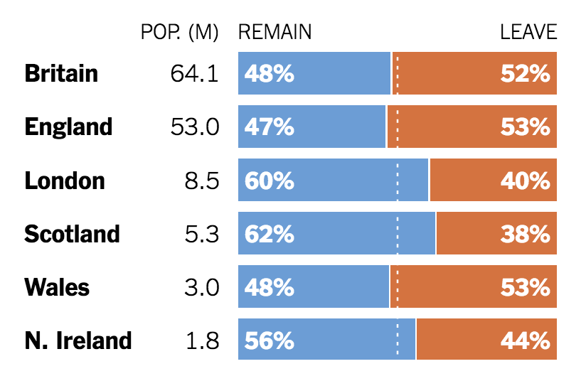
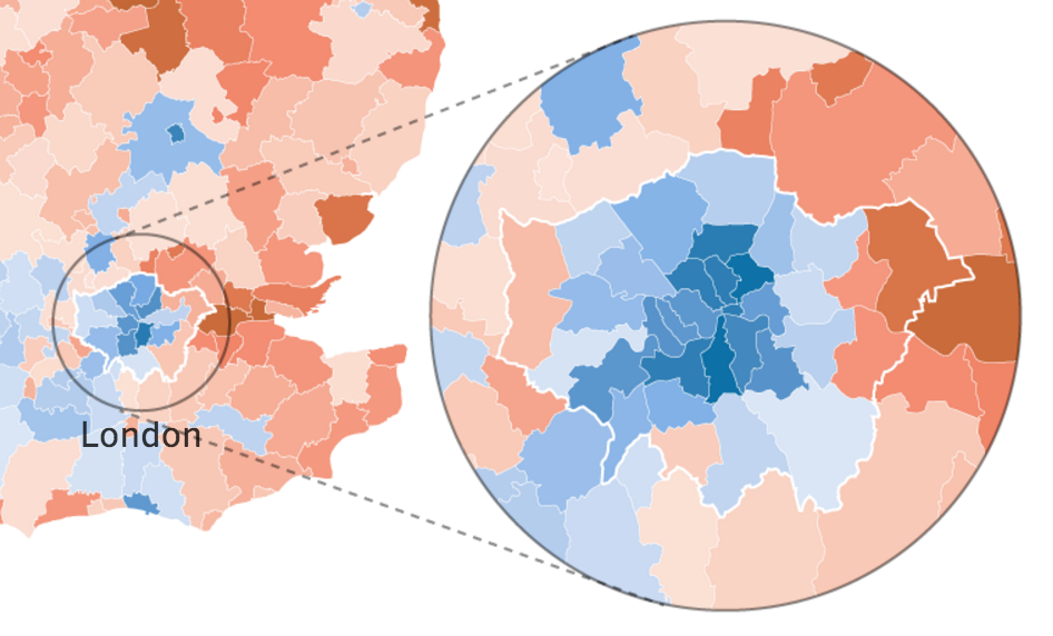
Sometimes there are other solutions to address an uneven population distribution. In this case we added a simple table that breaks down the result by region, along with population figures for each. This is not as efficient to read, but it still tells you that London’s population is bigger than Scotland and Wales combined. Another idea was to use a simple map call-out to magnify the London area, both to give it more visual weight and to make it easier to see details inside the city.
But wait, cartograms are still great!
This post is not meant to be a takedown of cartograms. They are useful and extremely powerful tools in data visualization, and for a lot more good examples I recommend Benjamin Hennings blog viewsoftheworld.net. Here, I just wanted to explain some of the problems cartograms face in news, which eventually led us to drop the idea.
Comments
wormcast (Jun 28, 2016)
Lame. You should have used both. Displaying only non-cartogram maps misleads the audience by concealing the population difference
eesur (Jun 28, 2016)
out of all the Brexit maps, I found this to be clearest and the one I referenced— thanks for sharing the reasoning—much appreciated!
David (Jun 29, 2016)
I wish you would write more of these cogent and succinct posts explaining the design choices made by the NYT’s graphics department. We could all benefit from your profound knowledge.