Looking at Mistakes in Infographics: The Profile of Italian Poverty
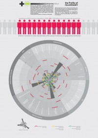 I just found the link to an infographic on Italian Poverty via @datavis. Before looking at the graphic I was interessted about how they pointed out the well known fact that in Italien the north is very rich compared to the south. So actually I expected a map or something, but the creator of the graphic decided to do it with some kind of spider chart. After looking at the graphic for a while, I noted that the creator made several mistakes and
 in order to “enlighten” the visualization world with my knowledge I decided to publish my notes right here.
Mistake No 1: Not showing the 100 people
In the first part of the graphics the author wanted to visualize that 13 out of 100 Italian are living in poverty. Unfortunately they only show the 13 poor people (red) surrounded by about 6 to 7 non-poor people (gray). This in fact visually implies a much higher poverty rate of about 65%. 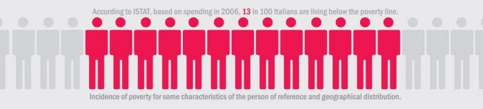 The corrected version of this ISOTYPE-kind of chart would look like this:
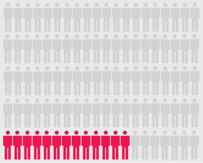
Mistake No 2: Mapping data values directly to circle radii
This is a very common mistake whenever circles are involved in data visualization. It’s been described several times (also by myself), and while there is still some discussion about the best way to map numbers to circle radii (square root vs. perceptual scaling), it is widely accepted that one cannot map them 1:1. This is exactly what they done in the infographic. 
Mistake No 3: Mixing several trends into one graphic
The last mistake that I want to point out is that the authors seems to mix up several unrelated trends. As said above, there is a strong difference between the poor south and the rich north of italy. Let’s focus now on the age-pie of the circle.
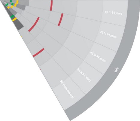
I created a horizontal bar version of it to make the numbers more readable for now. The chart shows percentages, but I asked myself “percentage of what?“. If we sum up the values of the South we end up with about 105%, summing up the values for the north results in something below 20%. So it can’t be the percentage of the total population living in poverty in that particular region. Seems like they show the percentages of the people living in poverty in Italy. This way they repeatedly mixing in the fact that they are more poor people in the South than they are in the North etc. This makes it impossible to compare the age profile between the different regions. In fact the age profile is quite the same for all regions. 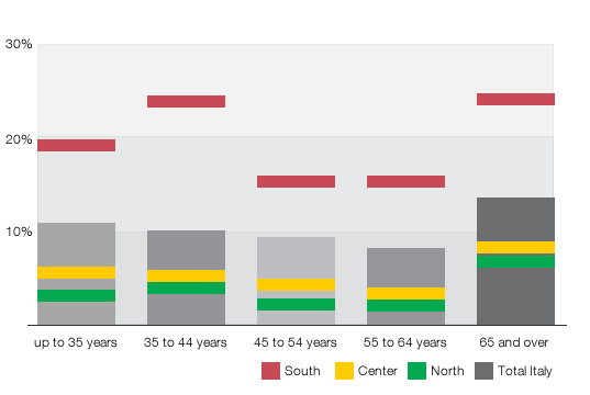 The same error occurs for the other pies as well. So, to give a résumé: The infographic looks very nice but is also hard to read and full of mistakes. There’s lot of this stuff out there in these days, way too much to critize them all. Maybe nobody cares..
Comments
Benjamin Wiederkehr (Apr 07, 2011)
Valid points, Gregor. Especially the spider chart is a tricky situation and a separation of the different topics would help the reader get insights from it.
Greg More (Apr 07, 2011)
Refreshing to see a critical dissection of a dataviz. More “enlightenment” most welcome
Gregor (Apr 07, 2011)
Sorry for the grammar and spelling mistakes.. After all, I’m no native english speaker. Put quotes around the “enlighten” to make clear that it isn’t meant that arrogant as it might sound..
Snu (Apr 07, 2011)
“in order to enlighten the visualization world with my knowlegde”
You might want to polish up your grammar and spelling knowledge before blasting out such arrogant bombs.
Jan Willem Tulp (Apr 07, 2011)
Great criticism, good points!
Harry (Jan 25, 2012)
Hi, I am Italian and I can assure you that we are poor also in making infographics! :)
I was searching for information about this kind of “content art” and I found this old post!
Hi Harry