Let's Break some Rules
A few weeks ago, while I was driving several hours towards our camping vacation, I suddenly noticed this beautiful piece of data visualization right in front of me. Actually, I found it that beautiful that I had to remake it in Illustrator:  I was completely stunned by the clean and simple layout of this gauge chart. It shows everything I, as the driver, need to know such as: How fast am I driving at the moment, how far have I’ve been driving at all, when is it time to get a new car. But then I realized that this tiny chart, despite its useful, intelligent design, violates some of the common rules of data visualization, so I thought it’s a good idea to write about it.
Why use a radial gauge chart at all?
Let’s face it, the current driving speed is not periodic data, so there should be no reason to use a radial layout. As we all know, humans are not as good in comparing angles as we are in comparing lengths. So why shouldn’t we use bar charts for displaying the speed? One obvious answer is that it makes a lot of sense to re-use established metaphors. Everyone who’s driving a car knows how to read the driving speed in a gauge chart, and probably nobody ever needs to be taught reading them. Another possible answer is that we connect certain semantics to the different regions of the radial gauge layout. No need to tint the last quarter of the gauge in red, everybody knows that this is the danger zone. We don’t have similar embedded semantics in a bar chart.
Not more than three data points
According to Jorges Camoes recently published rules of data visualization, the speedometer I fell in love with isn’t data visualization at all. That is because it doesn’t show more than three data points. That’s true, there are only 3 data points I can read in the display, and, if we subtract the LCD that was added to the bottom, there’s only one number left. One single number? Do we really need a big gauge dashboard display for one number? Of course we do, because a chart never shows just a single number. More importantly, a chart puts the single number into context. If you ever had to drive a car with a dashboard like the Renaut Twingo I, you’ll never forget that difference. For instance, in the gauge chart there are two red tick marks for important driving speed limits. Sure, I know those limits back from driving school, but I find it really helpful to see how my current speed compares to them. The other context is the capability of my car. If I’d be driving at 200km/h (which I never do), I’d instantly see that I almost reached the limit of my car.
Non-continuous scale
But now it gets even worse. As you might noticed, the speed scale breaks at 120 km per hour. Therefore comparing angles gets even harder. Without any doubt, that cannot be good data visualization! For comparison, here’s a different version of the same chart using a continuous scale: 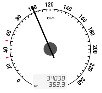 Now we lost half of the magic of the original design. Using the non-continuous scale the tick for 100km/h, the speed limit on primary highways, sits right at the 12 o’clock position. Can you imagine driving for hours and hours watching the gauge needle standing at 11:30 as shown in the above image? It just don’t feels right, and it would always push you to drive faster. Using the non-continuous scale allows to ‘stretch’ the speeds below 120km/h and thus makes them more easy to read. The difference between 30 and 50km/h in a populated area is more important than the difference between 130 and 150km/h on a German Autobahn. My car is a family car, not a sports vehicle. The designers probably wanted to emphasize the reasonable driving speeds, and that’s what I like most about the visualization.
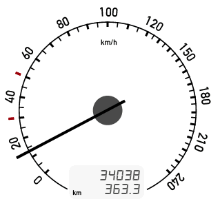
When to break the rules?
So, you know, the rules are the rules, but you should know when and why to break them. Of course it is allowed to display just a single data point in a chart. And of course it is allowed to add fancy annotations to the chart wherever you like. And, yes, it is even allowed to use radial charts for non-periodic data, as it is allowed to reject a certain chart type, just because the audience is not familiar with it. Whenever it makes sense.
Comments
Jan Willem Tulp (Jul 13, 2012)
Great post! There’s one thing missing which is also a function a an analogue speedometer. I know this from my limited experience from working in aviation:
In cockpits in airplanes you also still see lots of gauges with needles like this one, while you could have used a digital interface as well. The reason that these needle based gauges are still in use, is because it is much and much easier to estimate acceleration, which is really hard with a digital interface where numbers just flip.
So, there is also a motion component (of the needle) involved here! :)
Paul (Jul 13, 2012)
Sometimes I drive a Twingo, and the digital speed display indeed irritates me every single time. I wonder why I have no similar problem when reading a digital watch…
Jacob (Jul 17, 2012)
One observation that I can’t help but make is that the illustration above actually is not how most speedometers are designed. In the illustration here, you see that once you pass 120km, the distance the needle has to travel from one increment to the next is the same, but the increment of speed measured has actually increased. This is not correct because it distorts your actual velocity making it appear you are accelerating much slower than you actually are once you’ve passed 120km.
Typically a speedometer uses a constant increment. This brings me to Ash’s point about whether or not the capped out display actually correspondes to your vehicles max speed. Usually it doesn’t. Gregor pointed out that typically the “highway” speed sits at 12 o’clock, which is a great observation. In order to make it sit at 12 o’clock we need to pick a number range that allows for this to sit in the middle. So for example if we start the speedometer at 7 o’clock, then it would end at 5 o’clock (keeping with the clock metaphor). This means we need the exact same number of digits before 12 o’clock as after it. That said the max number is often completely arbitrary and has nothing to do with the capability of your vehicle to actually reach that number.
Now they could just choose to stop the speed range at say 3 or 4 o’clock, more likely your vehicles true max speed. If they did this however the radial graph would not be symmetrical. If you look at any vehicles dash design, it’s pretty likely that the design is symmetrical. This is because they are placing aesthetics above usability.
Gregor Aisch (Jul 17, 2012)
Thanks for your thoughtful comments!
@Jan I think you’re absolutely right with the motion/acceleration component, and I think Robert has mentioned this in his response as well. Haven’t thought of it while writing this post :)
@Miska Wow, that’s interesting! Thanks for pointing this out.
@Ash Although I’m not 100% about the maximum speed of my car, I still think that nowadays the speedometers maximum is somewhere near the real max, perhabs +/- 30km/h. However, for the point I was trying to make, the maximum speed doesn’t need to be absolutely accurate.
@Jacob I’d say that you cannot really distinguish between aesthetics and usability. You cannot really do one thing right while doing the other completely wrong. But that would be another discussion ;)
Ash (Jul 16, 2012)
Hello Gregor, I recently stumbled onto your blog and I find it really informative and interesting. I would like to point out one small point I wanted to mention about this article.
You state that “I’d instantly see that I almost reached the limit of my car.” but the numbers actually shown on the gauge of any given car are often (ie: most of the time) completely unrelated to the actual maximum speed of a vehicle, or even the maximum rated speed.
Often vehicles have speedometers which show speeds much higher than they are capable of. In older vehicles it was quite common for a speedometer to max out far below a vehicles maximum speed. (At least here in the US)
With regards, —Ash
paul van slembrouck (Jul 20, 2012)
check out the non-uniform scale of the old Cadillac speedo in my post. and here’s another one from 1909, only goes up to 60 mpg (http://forums.aaca.org/attachments/f169/63801d1283729768-cadillac-speedometer-100723-007.jpg)
love your work, especially the stuff with color space. thanks for the inspiration
Speedometer Design: Why it works | Visual.ly Blog (Jul 20, 2012)
[…] Aisch’s post last week on speedometer design hit close to home for me. My dad has been an automotive engineer and designer for more than 30 […]
Speedometer Design (That Thing in Your Car) | DATA + DESIGN by Paul Van Slembrouck (Jul 19, 2012)
[…] Aisch’s post last week on speedometer design hit me close to home. My dad has been an automotive engineer and designer for more than 30 years […]
miska knapek (Jul 13, 2012)
Thanks for the good post.
It’s funnily appropriate you picked a transport example. I believe a large part of what we now know as information design, came from the introduction of faster-than-horse/cart transport - motorised transport, whether by car, train or plane.
Suddenly many more people could travel further, and needed ways of knowing where they were going, as well as not getting lost too often. In graphic design, a great deal of rethinking of typefaces and information design happened, as the same signage systems used when people travelled by horse, simply couldn’t be read or understood if one travelled faster, say, by car. Back in the “good old days”, road signs might well be in caligraphic type, small, white on a black background. Try reading that at speed. One of the icons of this development was Jock Kinneir and Margaret Calvert’s “Transport” typeface.
Likewise, the demands on navigation systems introduced by airports, underground and train stations, also contributed significantly to information design. These days some of the companies specialising in web navigation design, also do (physical ;) navigation systems for airports.
Let’s Break some Rules » brock craft (Aug 02, 2012)
[…] Let’s Break some Rules — vis4.net. Cancel Reply […]
Patrick Martin (Aug 04, 2012)
I also think that we are trained to think in terms of radial scales beginning with our struggles to learn how to tell time on an analog clock. Later, I think this becomes the way in which we think of things which possess danger thresholds; pressure dials, voltage meters and so on.
I can imagine a day when the car layout is completely touch screen and configurable from font size down to speedometer.
Nice post!
r (Aug 08, 2012)
fine article! thanks for sharing r
Contemporary art and design | StudioNotes (Aug 10, 2012)
[…] Aisch recently wrote a posting about gauges, and how he finds them inspiring and beautiful in their simplicity, even though they are generally […]
Potential for improvement: Font legibility in cars | visurus (Sep 26, 2012)
[…] and worth checking out: Some weeks ago infovis experts have discussed speedometer design here and […]