Why We Need Another Mapping Framework
Over the last two years, cartography has drawn my attention from time to time. In 2009 I started my work in the field by porting the PROJ.4 library to ActionScript. My first notable interactive map application was a world map widget for the Piwik Analytics project, which is in use until today. It was born from the need to have a simple world map that is lightweight, easy to use and completely independent from external map services like Google Maps. A lot of things happened in the field since then and some cool mapping frameworks have been released. Google Maps keeps innovating and gives people lots of reasons to use their service, even on a commercial basis. But still one thing seems to never change: the Spherical Mercator projection.
Why should we care about map projections at all
So why should we care about map projections at all? To answer that question, I kind of like to point to an analogy to photography. As a photographer, you probably would never consider working with just one camera and a single ancient and highly distorted lens. Of course, it might be fun to work with that lens, but once you face its limits you get odd of it. Instead, you carry your big bag of equipment with you, knowing that for some shots you will need the tele, while for others you need a wide angle. Some lenses work good at night, others give you the best results in sunlight etc, etc. Good photo journalists know exactly how to use their equipment in order to put their objectives into the exact perspective and context they need to underline their stories.
In contrast, data journalists are nowadays limited to just one projection. To illustrate the journalistic dimension of this limitation I will now show you three maps of the same geographic area. The first uses the well-known Mercator projection:
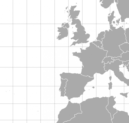
The Mercator map looks neutral, clean and… boring. In fact, the projection shows the earth as an cylinder shot from an infinite distance. You really can’t distort a view on our planet much more. Note that the area of Spain looks as big as (and maybe even slightly smaller than) Germany. In contrast, the next map uses an equal area projection.
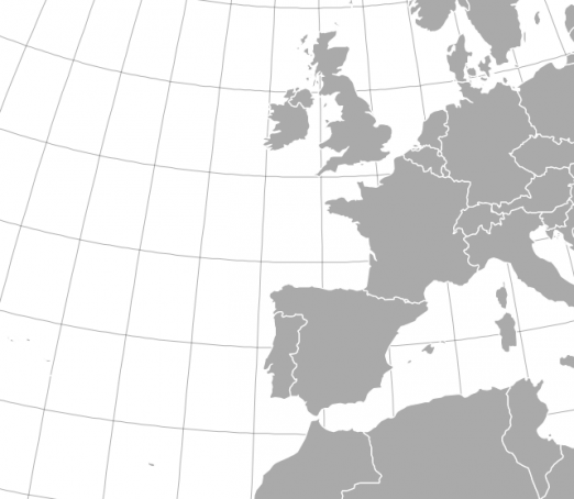
The curved grid lines indicate that we’re living on a spherical planet, but still we are looking at it from an infinite distance. Looking at the equal-area projection, one would now say that Spain is slightly bigger than Germany (in fact it is 141% the size of Germany). You can easily imagine scenarios where true areas are really important, say if you want to show the extend of devastation of the latest environmental disaster or something.. And finally, here’s the last shot which shows the same geography using the tilted satellite projection:
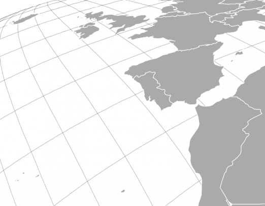
Now the projection looks more like a photography taken from a point more close to the surface (in fact, it was taken 4464 km above Morocco). It immediately places the viewer into the cartography and inevitably forces us to look to a specific direction. Using satellite projections gives us a completely different sense of scale and can shift the context of map-driven stories dramatically.
Now tell me, which data journalist would want to do without that?
Hello Kartograph
Since I know that it’s kind of unfair to propose new awesome features while knowing that almost nobody is able to use them, I decided to turn my ideas into code. For 4 months or so I had been working on a new mapping framework which I finally named Kartograph. Here’s a bit of the rationale behind Kartograph. Most notably Kartograph..
- ..allows to select and fine-tune the map projection, which is like the fundamental equipment for telling stories with maps
- ..ships with the tools needed to easily convert open geo data (shapefiles, kml, geojson) into interactive data-driven maps
- ..gives its users complete control about what to include in their maps and what not to include.
- ..puts a focus on reliable data visualization techniques.
- ..does not rely on hosted (and costly) mapping services like Google Maps or MapBox Of course, there is a lot of work left, and I’m currently looking for some way that allows me to continue the work on Kartograph for another two or three months. In the meantime I also plan to release a new version of the world map widget for the Piwik dashboard, which was kind of the initial reason for starting to work on the library. Now, I’m really curious for your feedback about Kartograph. Do you think it is worth the effort? Do you know of any existing library that can do the same? What are the killer features you would like to see in a modern vector mapping framework?
Comments
Jim Vallandingham (Mar 07, 2012)
So is this the project you mentioned on my blog way back when? I should have been more proactive on getting hooked into the development!
I certainly understand the rational of needing a solution that is independent of tiles, and hosted mapping solutions. The automated shapefile -> visualization is also a great idea and very much needed.
I was wondering if you could touch on your thoughts on what sets kartograph apart from something like d3.js ‘s mapping capabilities.
It has a limited set of projections: https://github.com/mbostock/d3/wiki/Geo-Projections
and the end result is svg that is styled using css. Is kartograph’s focus to really streamline the process in a way that is not possible with d3? Does the concept of layers in kartograph provide a more robust / easier to understand framework for building out a map (as opposed to, for example, just styling separate geojson files differently in d3).
I certainly think kartograph is a great option - just would like to hear what specific limitations of something like d3 that kartograph deals with. Thanks again!
gka (Mar 07, 2012)
Yes, of course I know about the geo features in d3 and would have loved to integrate Kartograph into the d3 ecosystem.
However, mbostock has once made the fundamental decision of not caring about legacy browsers like IE7, which is absolutely okay if you’re creating visualization libraries mainly for fun and/or academic reasons. But if you want to create a something that is supposed to be actually used in newsrooms that attitude simply doesn’t work.
I know that it is a petty and I really love d3, but for the reasons mentioned I had to build Kartograph on top of RaphaelJS, which, as you know, has built in a VML fallback for Internet Explorer.
The strategy for Kartograph is to at least provide the core features for IE users as well. Of course, some of the advanced features like SVG filters don’t work, but that should be ok since you can easily apply a different stylesheet for IE.
For some of the features that are not related to SVG I decided to at least use APIs that are somehow close to d3. For instance, the way scales work in Kartograph is quite similar to d3.
Of course, thanks to the low level nature of d3 it is also possible to mix both frameworks. Kartograph provides a simple interface for translating lat/lon coordinates to x/y and you can easily pipe those into d3 visualizations. I actually saw someone doing this last weekend :)
matt (Mar 07, 2012)
It is fantastic you took the time, patience, design skills, to create such a library to draw beautiful maps… from scratch.
This project, assuming you will make it Free Software (I hope so!), will have a major impact on web development and even apps in the future. Thank you for taking the time to do it. Kartograph was very much necessary and we are proud to have helped you start this project :)
Martin De Wulf (Mar 07, 2012)
Congrats,
beautiful work.
I have been thinking about doing something like this for months, after finishing http://migrationsmap.net, which is also built on top of Raphaël. I am at the same time glad and a bit jealous that somebody executed, and in an beautiful way, on this idea.
By the way for the geojson conversion to svg, you might be interested by the following script: https://github.com/madewulf/MigrationsMap.net/blob/gh-pages/geojsontosvg.py That said, it is neither very polished nor tested on multiple geojson files.
Michal Zimmermann (Mar 08, 2012)
Kartograph really looks gorgeous and even just watching the example makes me feel like I have never felt when using Google Maps :-) Can’t wait to give it a try!
Jim Vallandingham (Mar 08, 2012)
Awesome. Thanks for the clarification of why you chose this route.
As a suggestion, it would be great if the projections showcase http://kartograph.org/showcase/projections/#ortho
provided details about each projection - like:
- what type (conic, transverse,…)
- features of the projection
- good for aaa
- bad for bbb
Could help provide more rational for why people should care about trying out these other projections.
concepts cribbed from: http://maps.unomaha.edu/Peterson/gis/notes/MapProjCoord.html
santiago (Mar 08, 2012)
Greg,
Congratulations for the project.
I don´t see this as an alternative to tiles. I believe both can (should) converge (for instance working with geometric transformations on Mercator bitmap tiles). What do you think.
Gregor Aisch (Mar 09, 2012)
@santiago
You mean like they did in this webgl globe example? That is totally possible but will never give you the same quality compared to tiles generated after projection.
GeoVis Tools | Pearltrees (Mar 09, 2012)
[…] Why We Need Another Mapping Framework — vis4.net Geo Maps & Stats Globes virtuels, images satellites Earth, Space and Disaster monitoring panoramics, aeriennes space [+] R S/w friendly installing create virtual globe earth dapple Space Science solar R-software classifier amateur News journal Geo iphonetracker cartes Data visualization gephy Presentation tools facilement faire tweets Lido-Géo yourself photo visualization challenge articles bumgardner Vizualisation webgl small Socio-economics dream population tools for data visualization and analysis chart informes Geo-Spatial precise location Interesting work learn Mapping google Outils, ressources science OpenHeatMap magnitude #edtech20 resource ekiga Data Visualization ushahidi inspection Outils web autres organize Datavisualization color problem redesign flowingdata Softwares wordle simple source Data and Statistics statistical research Tools & Software for DataVis wordle tableau brings Data Visualization build graphviz изображений Tech blast stupeflix production Open Data mydata software SIG pédagogique fonds WEBDESIGN digital Comparateur d’images satellite comparison compare geofabrik Images satellites galerie imagery image Statistical Data interactive mapping naider Cartographie interactive driven scribble infographie / visualisation suburbanization Client cloud bjornharrtell carto 2.0. welcome new non classed smashing years OpenLayers services Maps medieval R- geo stuff Geo Maps & Stats home • contact • blog • fb • twitter to experience pearltrees activate javascript. […]
natevw (Mar 21, 2012)
Yes!
While I disagree that IE7 support should be a priority in a forward-looking framework, I’ve long been dismayed by the general zeitgeist that “web Mercator” tiles have solved cartography once and for all.
Over a year ago I did some experiments using WebGL to do morphing raster reprojection, and before that I had a shareware geotagging app called Mercatalog that would actually switch projections as you navigated around the map (e.g. polar for the poles, stereographic for higher latitudes and Mercator for mids). It was very fun to play with — I suppose I should combine the two ideas sometime!
Kartnotiser | Richard Öhrvall (Mar 22, 2012)
[…] datorkunnig vill jag tipsa om projektet Kartograph av Gregor Aisch, otroligt intressant, läs mer här. Eller föresten, även om ni inte är datorkunniga är det av intresse då Gregor tar upp viktiga […]
Kartograph: aus Geodaten individuelle Karten generieren » t3n News (May 15, 2012)
[…] auf den beiden JavaScript-Frameworks jQuery und Raphaël werden SVG-Files (vektorbasierende Grafiken) eingelesen und gerendert. Die SVGs kann man sich dabei entweder aus einem großen Vorlagen-Archiv holen oder auch mit einem […]
Rendering High Resolution Maps in Kartograph — vis4.net (Jun 03, 2012)
[…] the idea of starting the map creation process with choosing a map projection. As mentioned in my last post, the projection can be seen as a very crucial point of every map. It allows you to define the […]
Rich Harris (Mar 07, 2012)
Stunning - have been looking for something like this. The Italy example is beautiful. Can’t wait to give it a try. Thanks!
Christian Ledermann (Jul 30, 2012)
WOW, GREAT work, thanks a lot!
Yes I do think it is worth the effort, svg mapping is just in it’s infancy and as we have mature mapping solutions for bitmap graphics (WMS, Mapnik, …) I think that there is a sweet spot for applications like this.