Omitting Greenland Won't Fix Your Mercator Map
Yesterday I read an interesting article in the AI Journal, which is the german news journal of amnesty international. It was about how many people in the world having internet access and how some governments and companies are censoring internet content.
Thereby I saw this map:
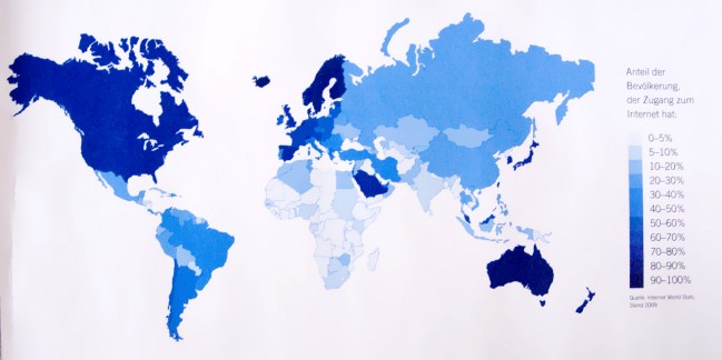
Thanks to the Mercator projection, the European countries are about twice as large as there are in reality, Iceland appears as big as Spain and Alaska as big as Australia. As it’s impossible to map the surface of a sphere to a plane without distortions, every map projection has to deal with some kind of errors. But there is at least one mistake that cannot be tolerated. Can anybody see where Greenland has gone? I mean, it’s quite a large country so it’s not easy to forget. I think they simply left it out. Who cares about the 57,000 people living there? Who cares about all the people seeing this map in the journal? Who cares about visualization integrity? At least not the editorial staff from the German AI Journal. So, I want to apologize to all people living in Greenland by completing this post with a map of Greenland in it’s real size and proportion. I know you are there! 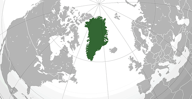
Comments
Visualization of World Internet Penetration | vis4 | information visualization (Apr 06, 2010)
[…] just made a corrected version of the previosly mentioned visualization using ActionScript. I tried a few map projections and decided to use the Winkel III projection […]