Doing the Line Charts Right
Lately I joined Datawrapper, an open source project that aims to provide simple, embeddable charts for journalists. Really, no fancy stuff here, we’re just talking about line charts and bar charts. Limiting ourself to those types gave us a good opportunity to think about the best of doing them. So it came that this week I was thinking a bit about the perfect line chart.
Listen to Tufte and keep it simple
Of course you cannot talk about perfect charts without mentioning the great books of Edward Tufte. Especially in the book The Visual Display of Quantitative Information he summed up a lot of good advices for line charts. He argued that it’s a good idea to look at what he called the data ink ratio and showed how the removal of certain chart elements can increase its readability. For instance you don’t need to draw a box around the chart area. Also you can use the ends of axis lines to display the minimum and maximum value in the data. 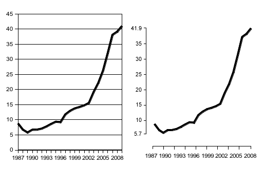
Forget about the separate legend
Separate legends are the worst-case scenario in the line chart world. Often one can find the legend below the chart, or in an arbitrary order. You want to allow instant identification of the lines, but forcing the viewers to look them up in a legend takes way too much time. Instead you should put the labels somewhere close to the lines. 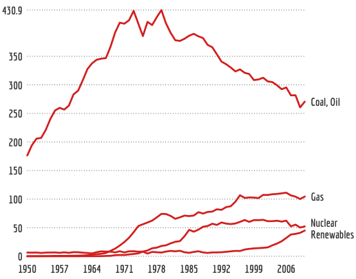 The great side effect of putting the labels next to the lines is that you no longer depend on fancy colors or disturbing symbols to identify individual lines. Extra points for simplicity.
Highlight what’s important
Although it is possible to tell hundred stories using a single line chart, it makes a lot of sense to keep the focus on just one story. Therefore you should highlight just one or two important lines in the chart, but keep the others as context in the background. 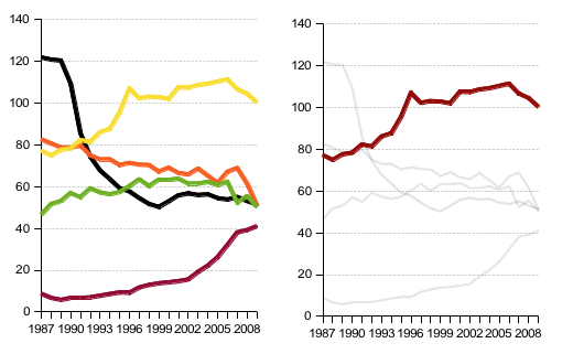
Baseline zero or not?
Sometimes you hear the advice that every (line) chart should have a baseline of zero, otherwise it would be “lying”. As a counter-example, here’s the (approximate) intraday stock quote data of the Facebook IPO day using baseline zero. The reason why nobody shows stock charts this way is obvious. 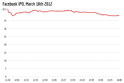 It’s almost impossible to see the ups and downs of the first day of the Facebook stock. Without the zero-baseline the chart reveals much more of the data.
 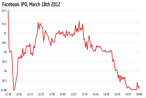 However, to minify the risk of confusing the readers with a non-zero baseline chart, I suggest to not draw the axes as connected lines. This way the y-axis doesn’t visually ‘touch’ the ‘ground’.
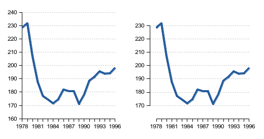
Finding a nice aspect ratio
The big advantage of line charts is that they enable the comparison of slopes, which is not easily possible in a bar chart, for instance. The problem, however, is that the perceivable slopes are highly dependent on the aspect ratio of the chart. The Facebook stock data would have looked much more dramatic in a taller chart. So which aspect ratio to chose? Some years ago, William Cleveland suggested a technique called banking to solve this problem.The core idea is that the slopes in a line chart are most readable if they average to 45°. In 2006, Jeffrey Heer and Maneesh Agrawala continued the work of Cleveland and described 12 different banking algorithms. I used one of the most simplest of them, the median-absolute-slope banking. Finally, here’s what the Facebook stock chart looks like after banking. The curve looks less dramatic now, but is still easy to read. 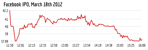 The problem with banking is that sometimes you need the chart in a certain aspect ratio to fit into a page layout. Especially if banking produces portrait sized charts. But why not let the optimal chart ratio define your layout? For instance, you can put the additional information to the side of the chart. Remember that the main goal of banking is to increase the readability of the line slopes. In the following example, the slopes for Nuclear and Renewables would have been much more difficult to see, if the chart would have been ‘squeezed’ to a landscape aspect.
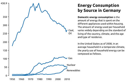
Turning best practices into actual tools
At the end, I am very happy to say that these best practices won’t remain gray theory in research papers. Everything I mentioned will be integrated in the upcoming release of Datawrapper, which I already used to produce most of the examples in this post. Please follow @datawrapper if you want to keep up-to-date with the project. If you have further suggestions or recommendations for line charts, I’m looking forward to read your comments.
Comments
Linksverkehr KW 25/2012 » YOUdaz.com (Jun 23, 2012)
[…] Doing the Line Charts Right […]
Jan Willem Tulp (Jun 20, 2012)
Excellent post! Two small remarks: placing a label next to a line could become an issue if multiple lines end at the same point. What would you suggest there? Separate legend after all?
And for stock charts, it might also be an option to show amount of change over time, instead of absolute values
Jorge Camoes (Jun 20, 2012)
Nice post, Gregor, a great summary of best practices when making line charts.
There is something that I’m probably misreading: in the Facebook charts the labels in the x-axis seem to be evenly spaced, but they shouldn’t.
Gregor Aisch (Jun 20, 2012)
@Jan Overlapping labels is definitely a case that needs special care. If there’s only small overlap of a few labels, one could use a vertical force driven layout algorithm. If there’s lots of overlapping I’d argue that there are probably too many labels in the chart anyway. I’d suggest a max of something around the usual 5 to 7 lines to chart.
@Jorge You’re totally right about the x-labels. However, for the sake of simplicity, the current implementation has no special treatment for date & time axes. Will look if there’s a way to add this in future versions.
T.J. Jankun-Kelly (Jun 20, 2012)
I agree w/ Jan: There is a reason we start at 0. The non-connected y axis may help, but I’m not sure it always addresses the confusion. Like Jan said, the importance of the Facebook IPO is the difference from start, not its high value (as said in the post itself). So “zero” would be the initial start and we measure differences from that point. Yes, its a bit pedantic (and the graph will look the same sans chart labels), but it communicates what it is showing more clearly and highlights what is important.
Lynn Cherny (Jun 20, 2012)
Gregor, this is really nice. A question for you: Sometimes you use the Y-axis vertical bar (and ticks) and sometimes you don’t. Tufte (if i recall) and the NYTimes usually don’t have it — at my office we’ve had a few arguments about it. Can you spell out your thinking there?
Gregor Aisch (Jun 20, 2012)
@T.J. Agree that thoughtfully transformation of the data brings lots of potential to increase the readability of the chart. Of course, that requires more domain knowledge than a automated tool can provide. However, changing the scale from absolute values to relative like differences or growth rates brings its own pitfalls.
@Lynn I have no clear opinion on whether to display the y-axis or not. Tufte did use them in some situations, even a second identical y-axis on the right side of the chart, if it serves some purpose.
Linkage: June 6th, 2012 to June 21st, 2012 | ben lowery (Jun 21, 2012)
[…] Doing the Line Charts Right — vis4.net […]
State of Data #104 « Dr Data’s Blog (Jun 22, 2012)
[…] the Line Charts Right with Best Representation of Facebook’s IPO […]
» puristischer umgang mit visuellen elementen (Jun 22, 2012)
[…] zwei tagen hat gregor aisch in einem lesenswerten beitrag über den puristischen umgang mit visuellen elementen referiert. doch wie weit kann man gehen? wann […]
Michael Aufreiter (Jun 25, 2012)
Slightly outdated, but I’ve written up a post regarding modeling chart data.
http://quasipartikel.at/2010/05/04/in-search-of-a-suitable-object-model-for-describing-charts/
This is a newer one on how to use the data-join concept of D3, but with a Backbone-based View model.