Let's Keep Symbol Maps Clean And Tidy
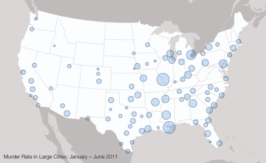
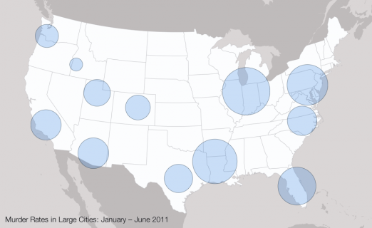
In his great blog The Daily Viz Matt Stiles recently posted this map of US crime rates. The map shows murder rates in different cities as bubble symbols and it strongly reminded me to write about the problem of overlapping map symbols.
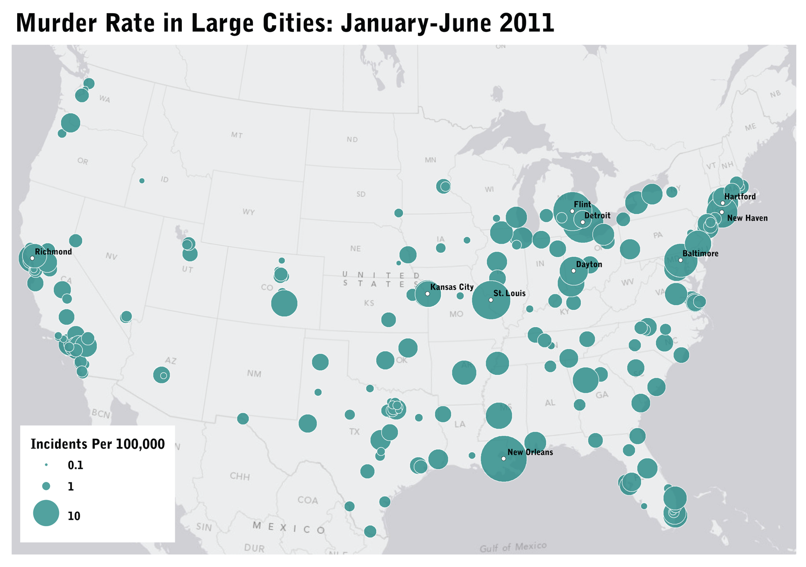
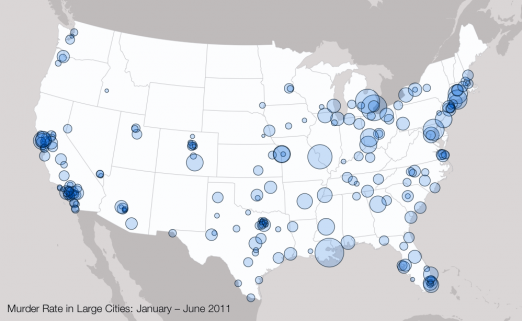
To illustrate the core of this problem, I remade Matts map but used transparent symbols.
One could argue whether a map is the ideal visualization of this data set or not, but I will skip this discussion for now. Let’s assume that you really want to see the geographical patterns in your data and thus will go for map with circles which area represent crime rates.
What’s so bad with overlapping symbols?
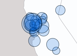
In the case of our crime rate map, the main problem is that overlapping circles will be perceived as a connected area. And since area is a cue for crime rate, we connect a large connected area with a high crime rate.
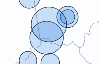
Another problem is that some symbols are completely hidden behind others. In the crime rate map this results in a distorted view on the data since where we’re actually looking at the maximum crime rate of a geographic region instead of the average crime rate.
One way to get around these issues is to combine overlapping symbols into a new symbol. Later in this post I will describe this process in more detail. Here’s how the cleaned crime rate map looks like.
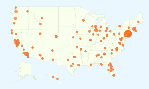
In other scenarios, a problem of overlapping symbols might be that you don’t see how small values would eventually add up to a larger value. A great example is the following map which some of you might well know from Google Analytics. What do you think, from where do the most visitors come from? It’s California.
To demonstrate this effect, I mapped the crime statistics again, but this time I used the actual number of murders instead of the rates. Without any cleaning, the map looks like this:
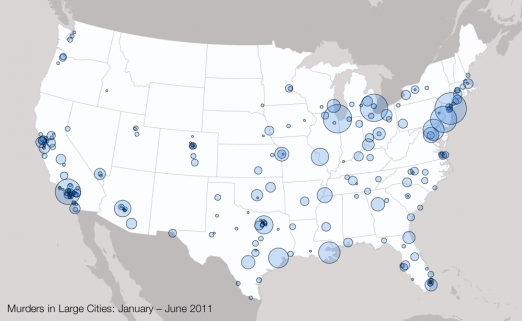
Thanks to the transparency of the symbols you at least get an idea of the data you’re probably missing, but still, we are quite bad in mentally adding the areas of overlapping circles. Let’s compare this to the cleaned version:
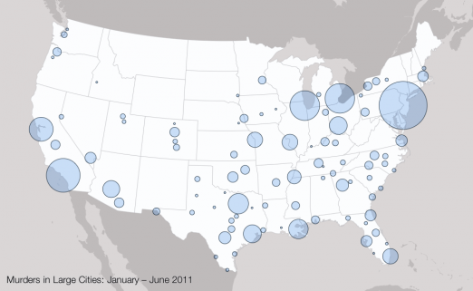
Looks much better, doesn’t it? This time, New York wins the race.
The dirty math behind this
Well, the math itself isn’t that dirty. The basic concept goes like this:
- Look for intersections between symbols.
- Combine two intersecting symbols into one.
- Proceed to 1.
1. Finding intersecting symbols
If you’re dealing with circular symbols, the intersection finding is pretty easy. For each pair of circles we need to check if the distance between the center points is smaller than the sum of both radii.
Just make sure to not check a circle against itself :). Stop as soon as you found intersecting circles and proceed with the merge step.
2. Merging symbols
For merging of symbols, I prefer keeping references of all original data items (eg cities) in the merged symbol, which is kind of useful for updating the radius. For instances, if you want to merge the murder rates of two cities, you would divide the sum of murder incidents in both cities by the combined population of both cities, which is not the same as simply averaging the murder rates.
The postion of the combined symbol is calculated as the weighted mean of the original positions. This ensures that the merged symbols don’t move away too far from it’s original center of gravity. The weight itself is defined as:
The new position is then calculated in (lon, lat) coordinates and converted to (x,y) afterward using your favorite mapping software.
Both steps are repeated until all intersections were removed. You can easily control the granularity of map symbols by changing the radius range for the symbols.
Final thoughts
While this process is trivial from a mathematical/algorithmic point of view, I know that it might be not as easy to implement this using tools like Google Maps. But that’s kind of a weak excuse, isn’t it? We need better tools for mapping.
Update
My interactive mapping framework Kartograph now supports for two different symbol clustering algorithms. See them in action, and read more about how to use them.
Comments
Gabriel Florit (Dec 20, 2011)
Great insights Gregor! I bet D3 is a great tool for math+maps.
Ben Jones (Dec 20, 2011)
Gregor - thanks for the pro tip, I agree the cleaned up version feels much less chaotic, and is easier to glean info from. I’ve made a few overlapping maps with Tableau - it would be nice to see capabilities added in some of the “non-programming” map tools to adjust per your recommendations. It might be harder to do when individual bubbles can’t be combined, such as when they represent a discrete address, etc. Thanks again.
Craig Williams (Jul 13, 2012)
The classic simple way to handle this issue is to sort by size and draw larger features in the back so smaller circles are always visible.
Unit 6 Reading | Information Design (Nov 14, 2012)
[…] Murder Rates Link Share this:TwitterFacebookLike this:LikeBe the first to like […]