Take Care of your Choropleth Maps
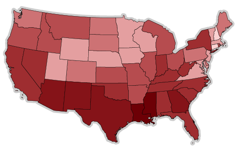
Over the last week I had some fun playing with choropleth maps. Thereby I analyzed the following US poverty map, which was recently published at the Guardian data blog:
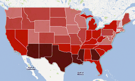
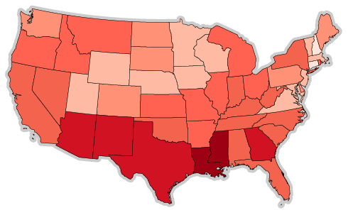
To be honest, the first time I saw this map I didn’t thought much about it. Ok, poverty is highest in south central of the United States, especially near Mexican border. But recently I used the same data to demonstrate a choropleth map that I created from-scratch and I was really surprised to see a somewhat different picture:
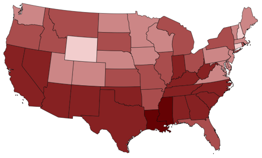
Naturally, I wanted to know where the differences come from and spent some time to investigate. Actually, I think there are two big fails in the Guardian map (which was made using Google Fusion tables).
Don’t mess around with your class limits
The values in the poverty data range from 6.6% to 22.7% and the map shows them divided into five classes. If one would compute the exact equidistant class limits between the minimum and maximum value one would come up with the following classes (the gray bar is used to indicate the data range):
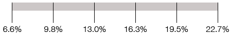
I’m not sure if this is the default behaviour of Google Fusion Tables or the editors choice, but the Guardian map used the class limits 6-9%, 9-12%, 12-15%, 15-18% and 18-23%. Due to the round numbers one might think that they are easier to understand than the fractioned numbers above, but this comes at the high price of distorted class distribution:
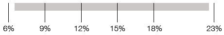
Note that the fifth class (which shows the poorest states) is blown up while the first class is a bit under-represented. Given the highly political topic, I’d argue that while we’re trying to map inequality, we should at least use equally distributed classes.
Don’t mess around with your class colors
The second big failure of the map is the choice of colors. This colors were used for the Guardian map:

Obviously, there’s a large jump between the first and second class and an enormous jump between the fourth and fifth color. The fourth color looks like taken from a completely different gradient and is hardly distinguishable from the third color. Again, I’m not sure if this is some kind of default in Google Fusion tables, but maybe they were just hand-picked. Instead, in my map I simply used equidistant colors from a HSV gradient:

But, as mentioned in the comments below, even equidistant HSV colors are not the best option. The problem is that humans perception of brightness differs from the arithmetical lightness of HSV colors. To demonstrate this difference, let’s compare the equidistant HSV colors to a hand-picked color scale from colorbrewer2.org:
Quite a different picture, isn’t it?
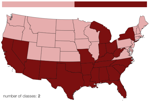
And better think twice about your class count
Another question is why we should use five classes at all. It’s kind of interesting to see how “dramatically” the picture changes if one changes the number of classes. Given the fact that we’re living in the age of interactive maps that allow us to read data values from tooltips, there’s no more reason to be stingy with colors. At least, I think a number of seven classes should be a better trade-of between correctness and color distinguishability.
Be careful when visualizing non-area-related data using choropleth maps
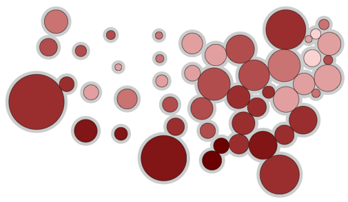
At the end I just want to mention another well-known problem of choropleth maps. The visual significance of a particular geographic region depends on the color value multiplied with the area of that region. Thus, a larger but equally colored region appears more important than a smaller one. Especially when you’re dealing with non-area related data, like the poverty of human beings, this might cause additional mis-interpretations. One way to get around this is to use cartograms, which aim to resize geographic regions according to a measurement that has more relevance to the context of the data. For instance, in the next image you can see a Dorling cartogram (where circles represent regions) that sizes the states according to 2010 population. This way, we visually relate the poverty rates to the affected population instead of the affected area.
So, what to do next? For me, the clear answer is that we need better educated map makers and, perhaps more importantly, we need better open source tools for thematic mapping. That’s what I’m kind of working on right now.. Update: Jorge Camoes wrote a kind of follow-up post to this one, called The same data, the same map, different stories. Make sure to check it out as well.
Comments
Gregor Aisch (Dec 02, 2011)
I added a version using one of the color scales from colorbrewer.
Cameron Laird (Dec 08, 2011)
Good show! I admire this piece enough that I’m bringing it to the attention of more readers through http://www.reddit.com/r/visualization/comments/n4w1s/the_guardian_illustrates_regional_differences_in/
How to define classes for your thematic map The Excel Charts Blog (Dec 05, 2011)
[…] published last Friday an interesting post and I wanted to play with the same data, percentage of population living in poverty (and use my […]
Rick (Dec 01, 2011)
On the colour front: equidistant on the HSV scale isn’t the same as equidistant perceptually.
http://colorbrewer2.org/index.php?type=sequential&scheme=Reds&n=5
is probably what they (should’ve?) used.
The Dorling cartogram’s a nice idea, I haven’t seen them used very often.
Jeff Weir (Dec 05, 2011)
I think the Dorling cartogram is interesting, but suffers from the problem that it’s much harder for a human to compare different sized circles as it is for them to compare say the bars on a bar chart.
By the way, I wrote a guest post on choropleths a while back here that might be interesting/relevent http://chandoo.org/wp/2009/07/24/medicare-chart-critique/
Gregor Aisch (Dec 01, 2011)
Hi Rick,
You’re totally right with your remark on the non equidistant perception of equidistant HSV values. That’s what I’ve been thinking about while I wrote this post. Actually, when we talk about perceived brightness at screens, we’re touching the field of gamma correction, which is a pretty easy task as long as you know the output device. Colors that work on my laptop screen look completely different on my external monitor and so on. If you know about any useful study on the problem of gamma correction for unknown devices I’d be glad.
Regarding color brewer I have to repeat what I said in one of the comments to my last post: I like the colors but I don't like the terms of service. Maybe that's why I keep experimenting with different color scales. At least, my color advices are be free to use for everyone.Finally I changed my mind on the color brewer license. It's a good ressource for color scales.
Axel (Dec 02, 2011)
Interessting to read. I’m working on a Choropleth Map using Raphael and blank SVG maps from Wikipedia right now for a project. Do you have a hint for a convenient conversion workflow from SVG data to JSON notation?
Nevertheless, I will keep your advice in mind. Was using Google Fusion Tables, too, first, but want to avoid flash. Now I have to do the calculation myself.
Best regards, appreciate your work. XL
Rob Shell (Dec 02, 2011)
I like the idea of using equidistant HSV values. I’ll definitely be using this as a resource in my next choropleth mapping project.
What’s up with Michigan on your maps? You’ve increased the “visual significance of a particular geographic region” by coloring Lake Michigan.
Jorge Camoes (Dec 02, 2011)
Nice. These are two relevant topics, and not only to map making. I agree with you regarding the use of color. Let me add my two cents regarding class limits.
I’m tempted to say that using equal interval classes in a map is like using alphabetical sort in a bar chart. I would prefer classes that minimize intra-class variation instead of the round-number principle. If you have this sequence: 103, 108, 147, 153 it doesn’t make sense to set a limit at 150.
Dividing a data range into several equal-sized classes is very dangerous. Try to do it with population density in the US and you’ll see what I mean.
This is a relevant topic. Glad you bring it up.
Ben (Dec 02, 2011)
Informative article, thanks!
We have been recently using leaflet.js with underlying cloudmade maps and geojson overlays to produce slippy choropleth maps. We’ve taking the shape files into QGIS, simplified them there, the exported them to GeoJSON which then has the geometry and the property attributes tied in. You can then render then with 2 lines of javascript in leaflet.js to colour using ColorBrewer for instance.
Well worth having a look at those tools. Also agree that a better thematic map tool chain would be good.
Ben
Seth (Dec 06, 2011)
Why have classes at all? Why not just color each state according to its data value?
As for which colors, here’s a nice demonstration of how Lab* space is a better choice than HSV for choosing colors for data visualization: http://davidad.net/colorviz/
Kartor och färger | Richard Öhrvall (Dec 17, 2011)
[…] Det visas på ett tydligt sätt på den här sidan. Det är även illustrerat på den utmärkta bloggen Vis4.net där följande bild är hämtad […]
Readings: Wk 6 « Omar Bilal Akhtar (May 08, 2012)
[…] Choropleth Maps […]
A Crash Course in Data Journalism | Journalist in Residence (May 05, 2012)
[…] other source. What the story “says” depends on the choices made. Consider how simple changes in color palette can lead to different interpretations of the same […]
So You Want To Be a Data Journalist: The Ethics of Mapping « thewaywardrose (Feb 23, 2012)
[…] Aisch, a self-process data geek, recently cautioned about the failure to accurately depict data in choropleth maps. Acting like a data viz critic, he […]
Michal Zimmermann (Mar 08, 2012)
Is there easy way (open source or free) to create Dorling cartogram? Is it possible to use rectangles instead of circles? You are probably right that 5 classes are just not enough (can’t judge it though as I haven’t seen distribution function), but Google Fusion Tables don’t let you choose more than five intervals. I don’t think equidistant intervals are always the best choice - I would say they are not. But it depends on the structure of data you have.
Gregor Aisch (Mar 09, 2012)
@Michal Zimmermann
You may want to check out this very basic cartogram generator I used for the example in this blog post: https://gist.github.com/1433392
Practical mapping by drbazuk - Pearltrees (Dec 23, 2011)
[…] Take Care of your Choropleth Maps — vis4.net […]
Week 5 Dataviz Critique and Readings Summaries « erinrichey (Feb 22, 2012)
[…] really enjoyed the analysis of choropleth maps in vis4.net. Since it was easy enough to identify the tools used by The Guardian to generate their map, the […]
Week 6 Readings « keldyortiz (Feb 22, 2012)
[…] it is important to note the misrepresentation that can happen when creating a type of map such as this. While reading about this topic on choropleth maps, I was trying to understand why there was […]
Summaries for Week 6 | A Year in J-School (Feb 26, 2012)
[…] essay was created as a response to a choropleth map created by the Guardian which supposedly illustrated the areas with the most severe poverty in the […]
Techniques for Transportation Data: Simple Choropleth for Trip OD « Visualizing Urban Futures (Sep 24, 2012)
[…] Obvious problems with choropleth maps are the reliance on borders and the visually complex images they produce. With smaller zones, and a greater number of colours and borders, there are issues with visual confusion. One way to get past this is to use the largest, most regular zone systems that are feasible, and to minimize the number colours to less than 5, or greater than 20. in the first case, differentiation between zones is easier, while in the second, general trends on a larger scale can be seen. For a more nuanced understanding of issues with choropleths, check out this discussion at vis4 (Link) […]